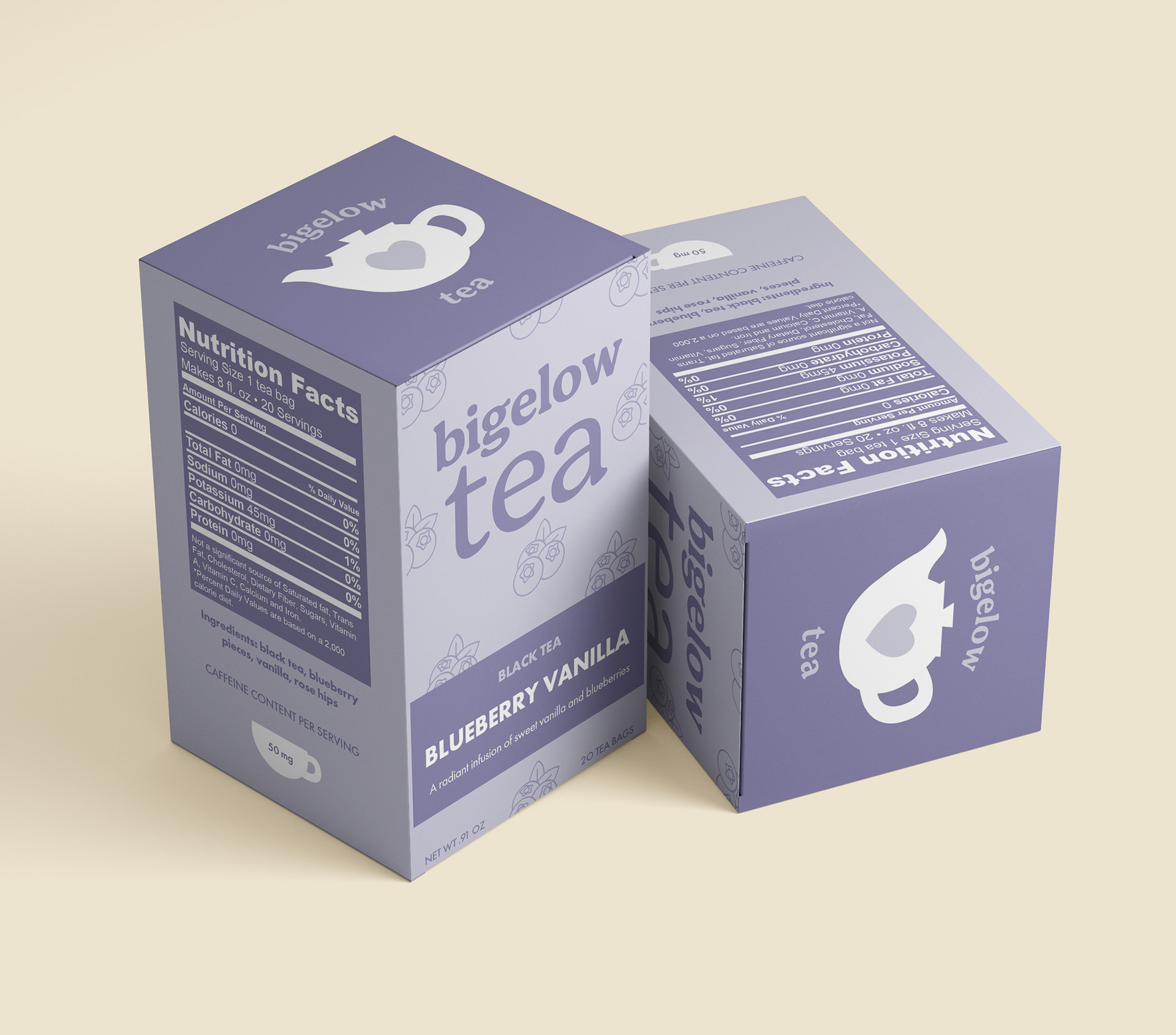
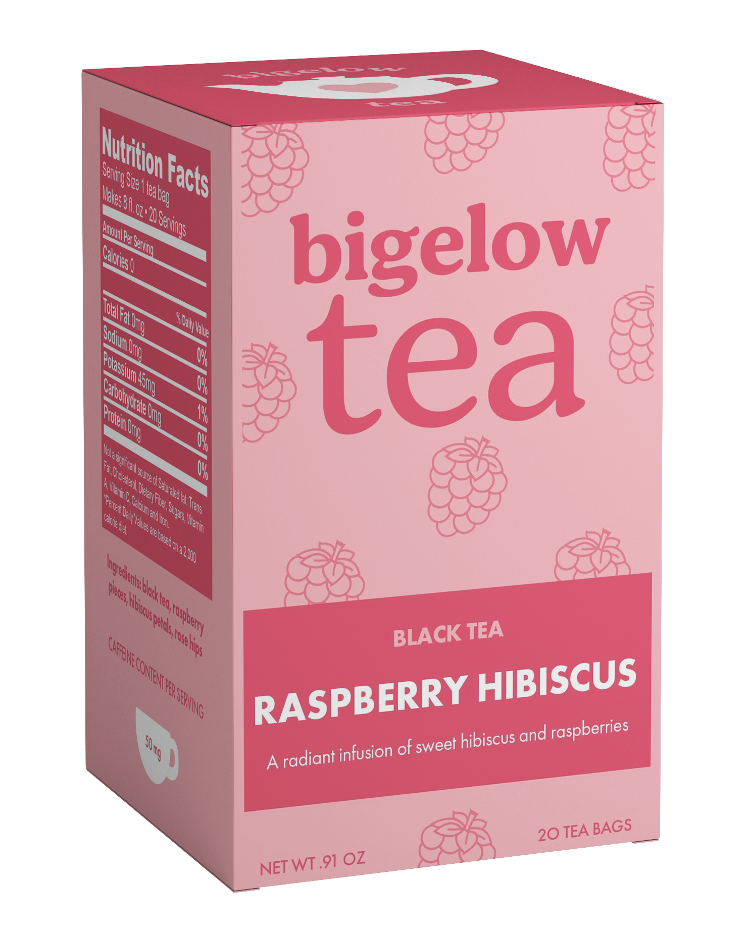
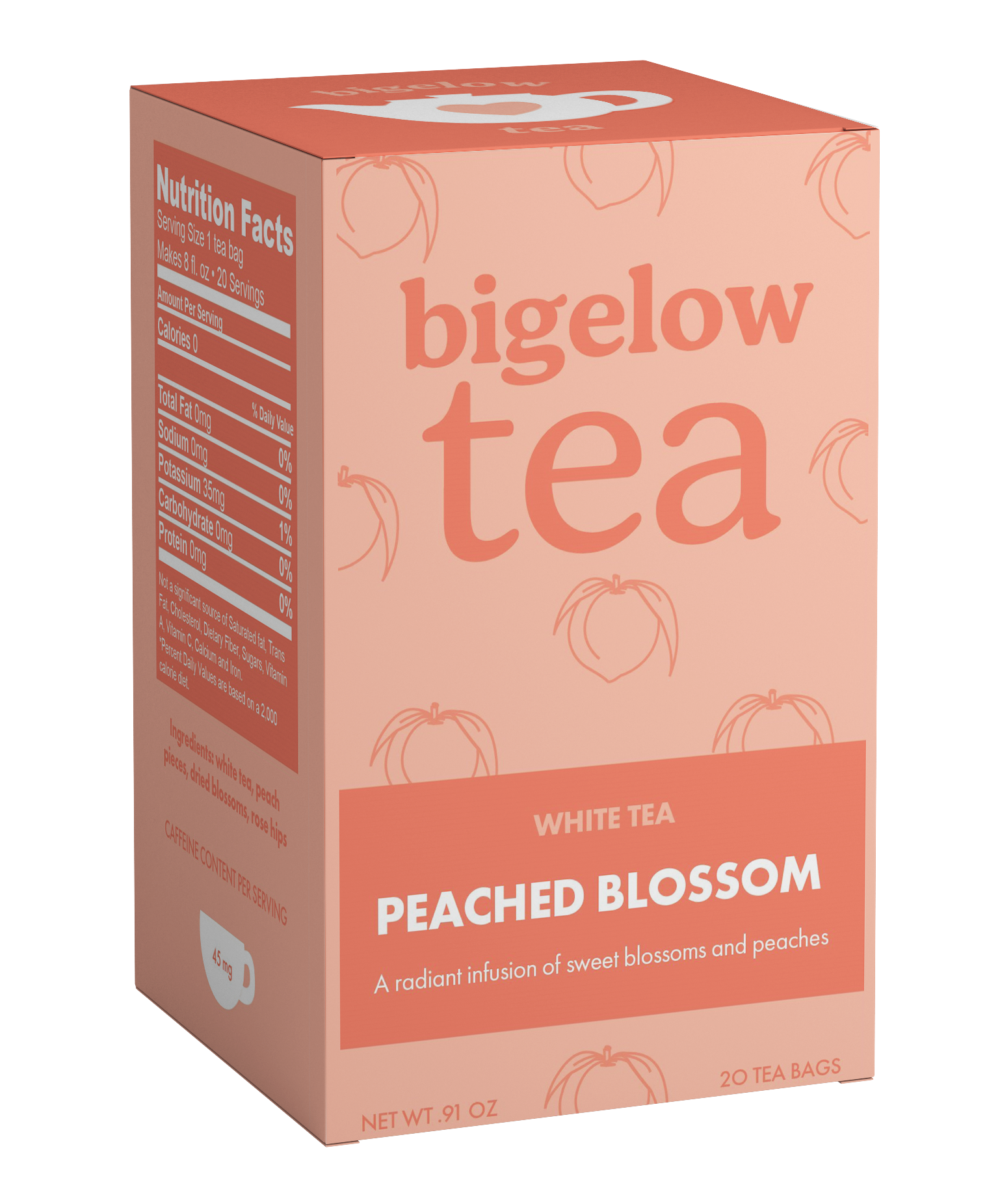
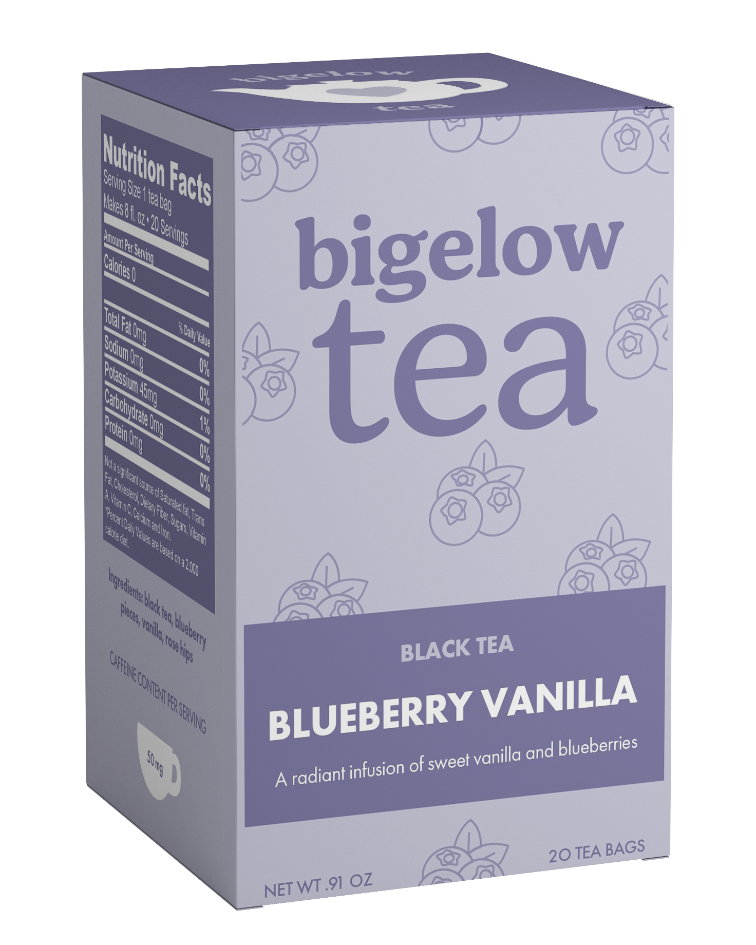
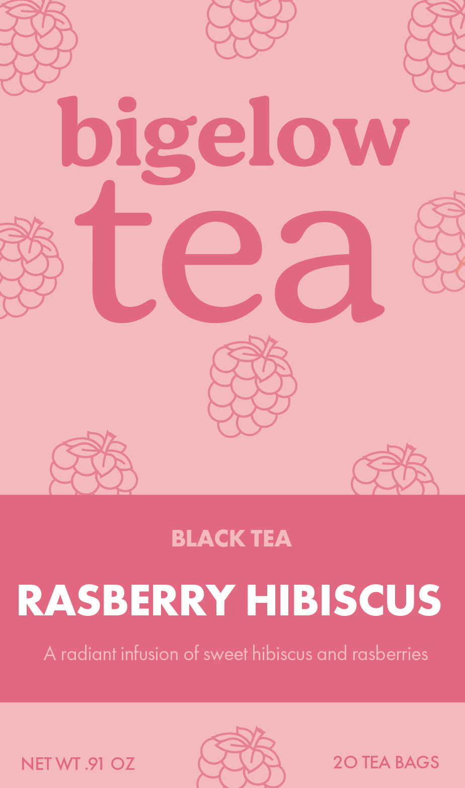
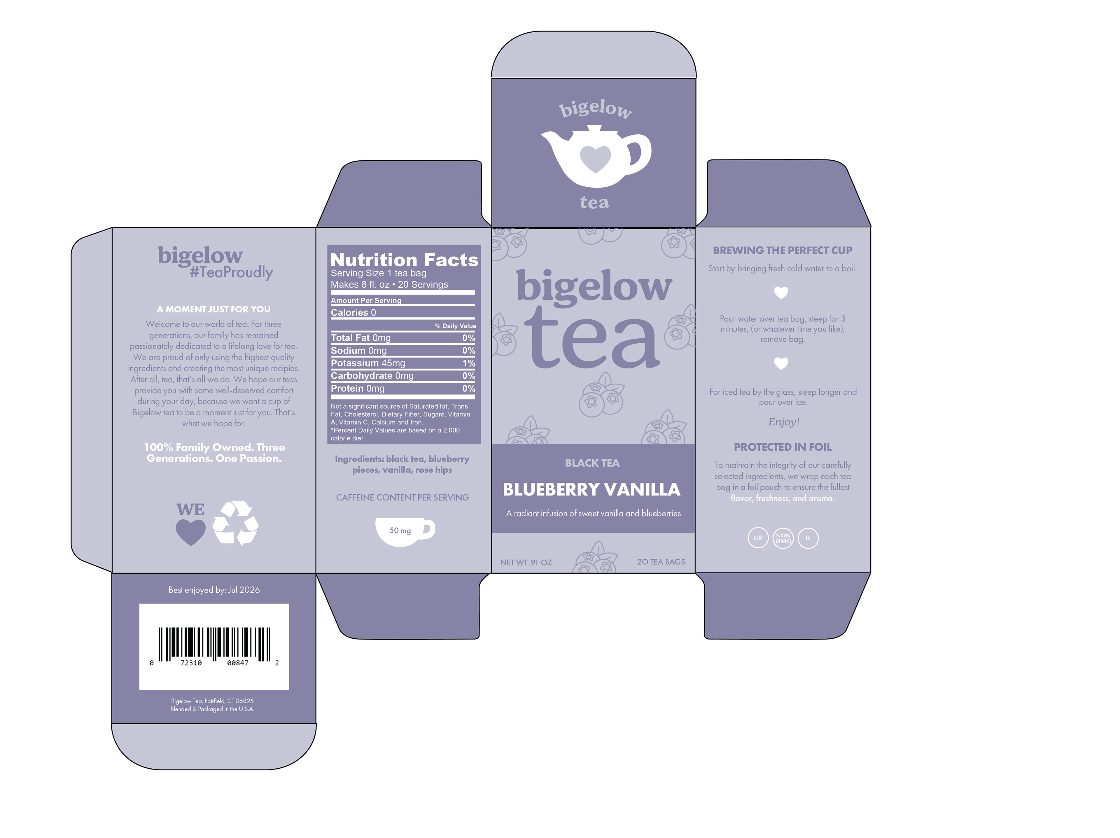
packaging redesign series: bigelow tea
tools: illustrator, photoshop
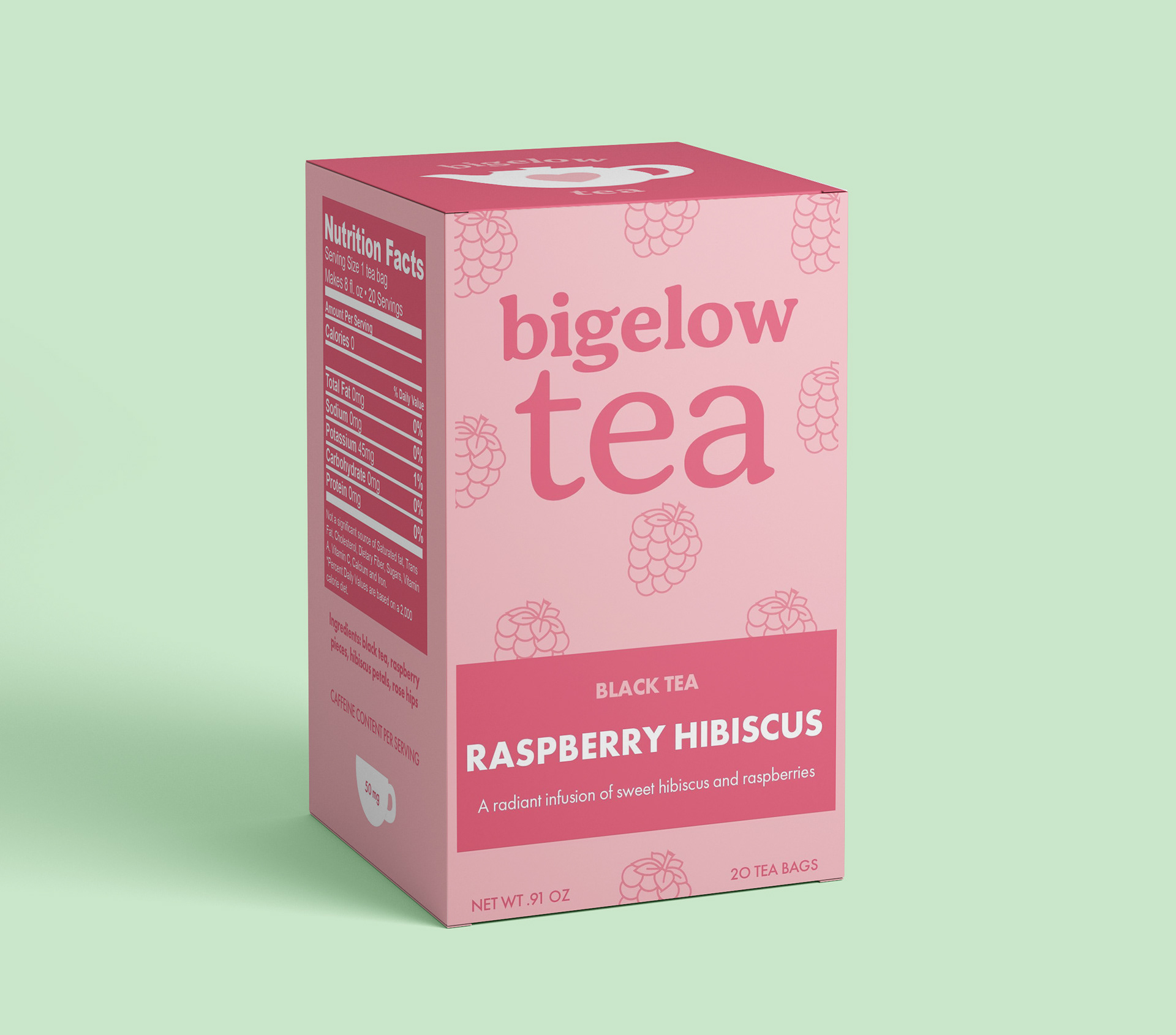
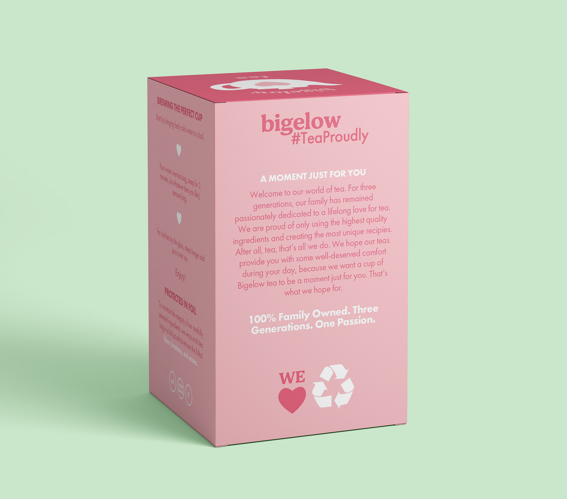
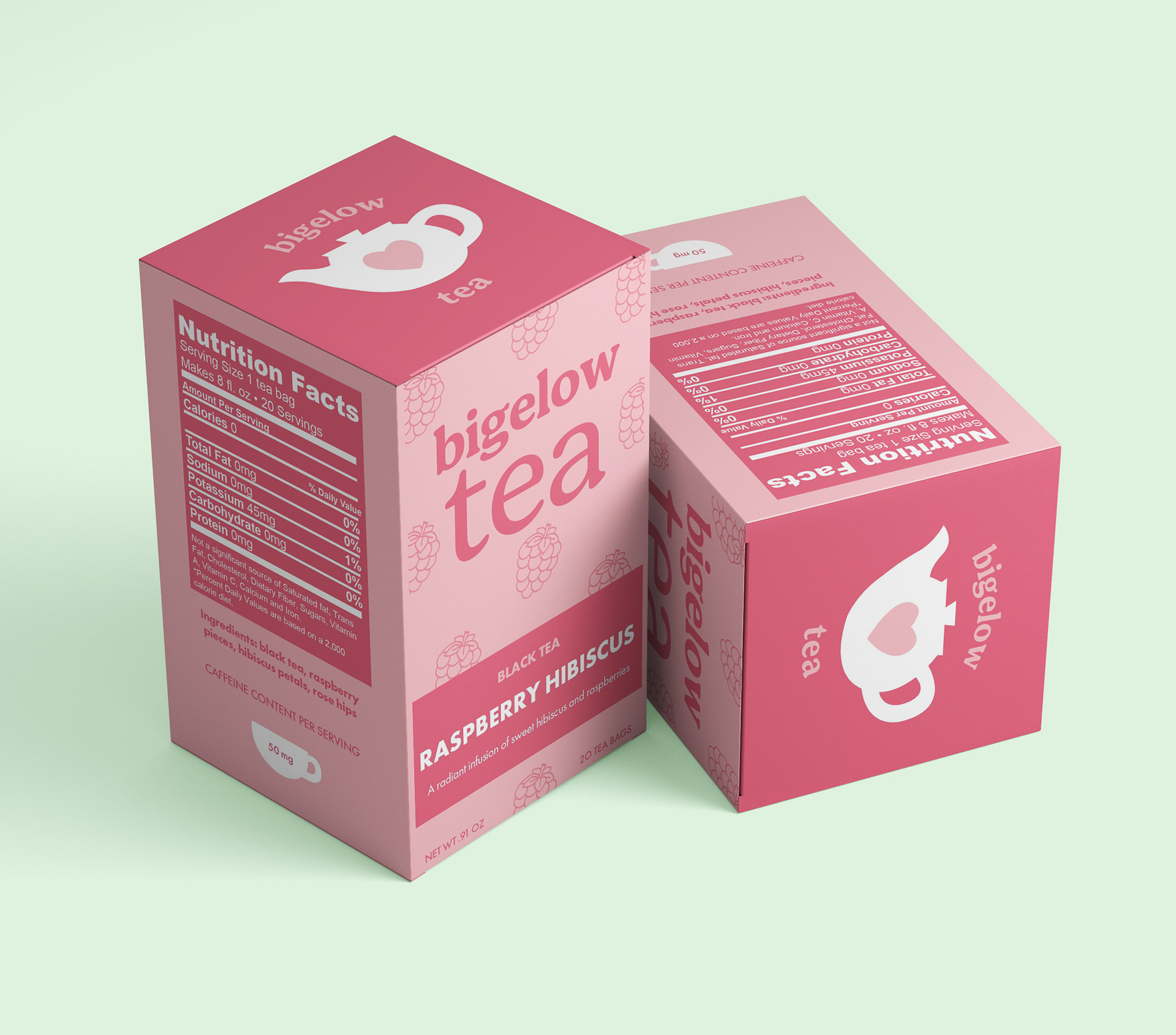
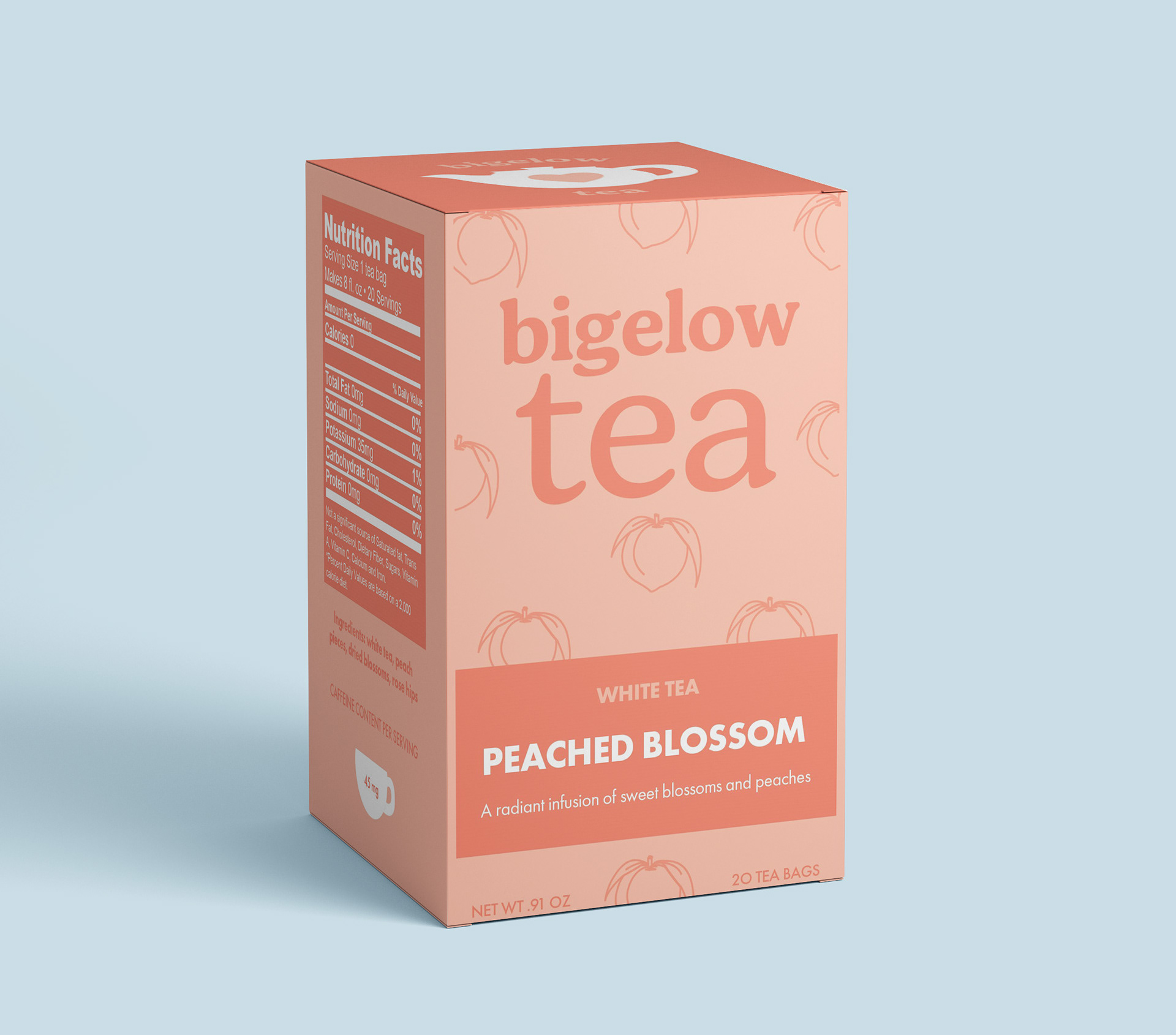
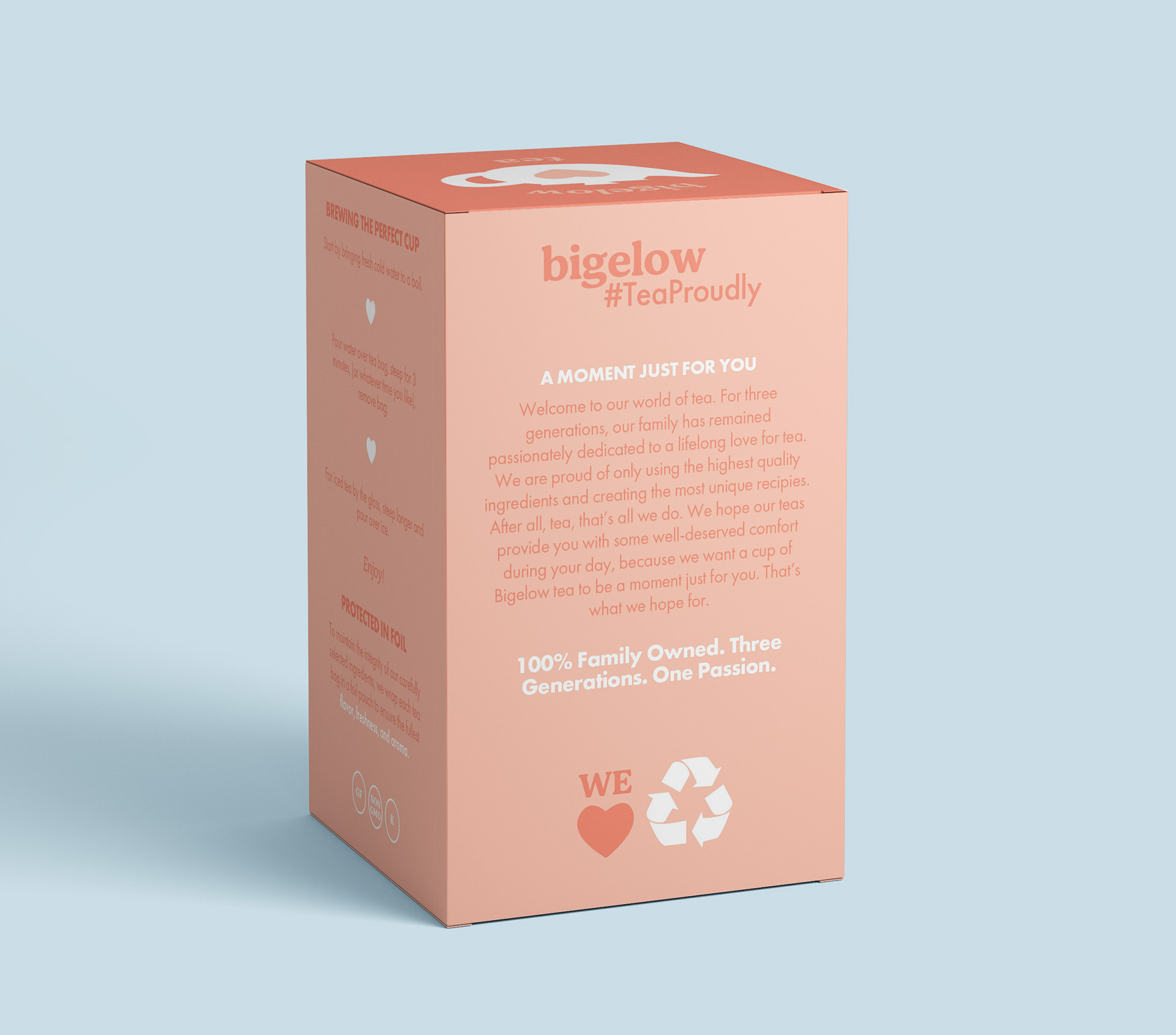
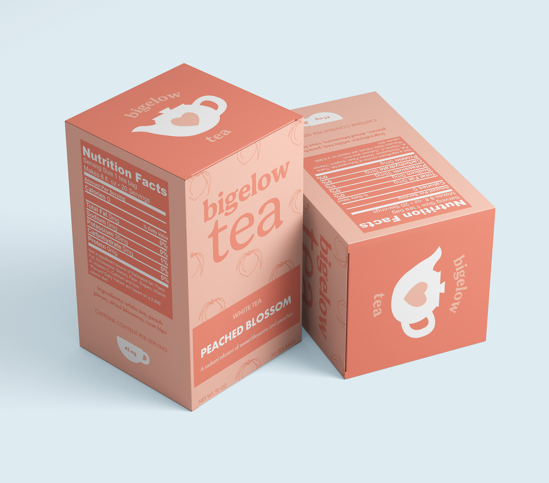
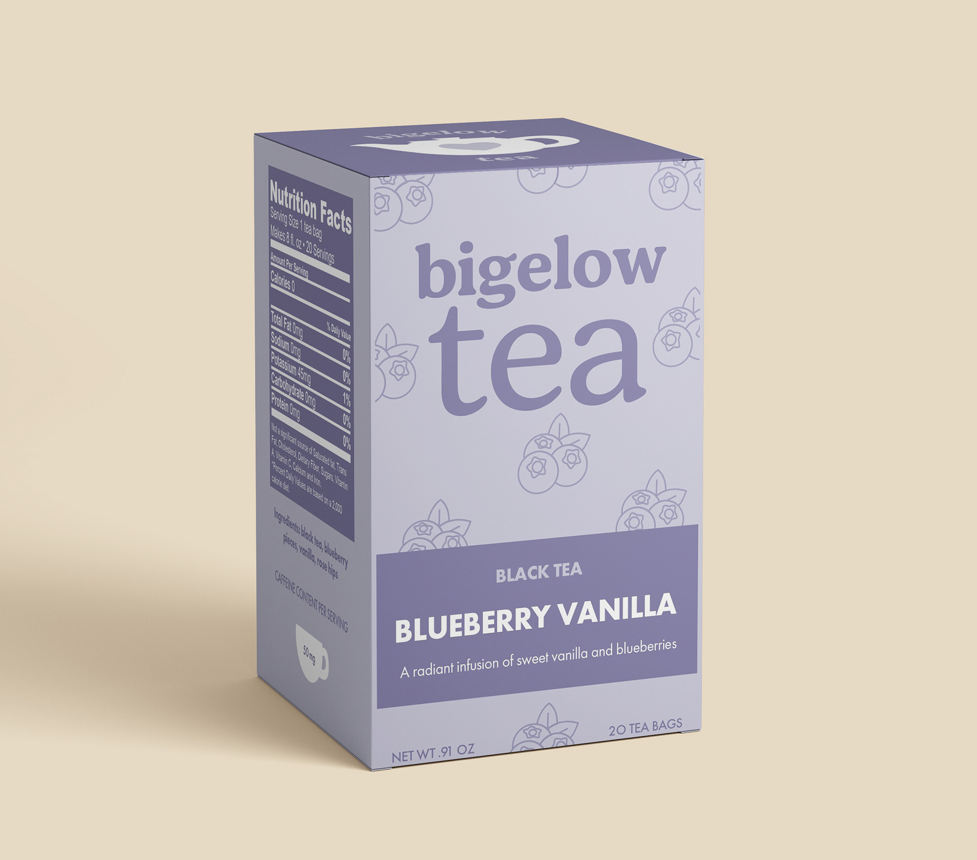
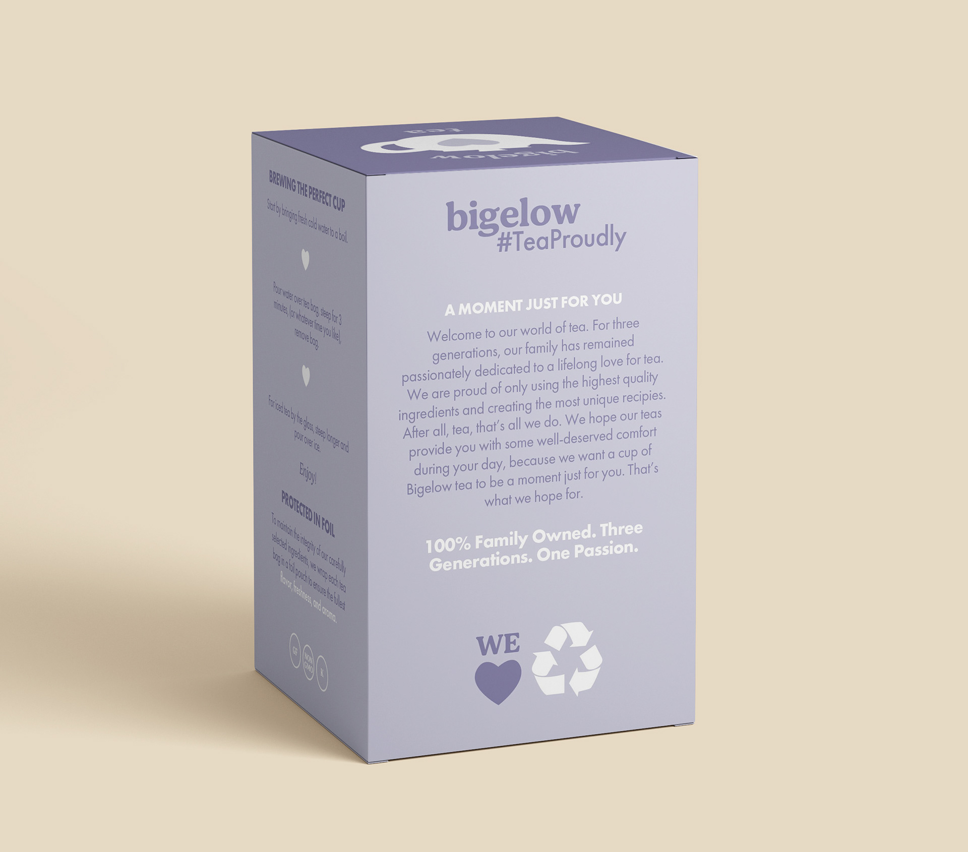
Objective: I was tasked with redesigning and creating a stronger identity that accurately captures Bigelow Tea's values, creating a more simple design overall. With minimal typefaces, utilizing visual hierarchy, & creating a simplified color palette, I could still keep the “eye-catching” aspect of the original packaging but with a fresh modern twist.
Creative Process
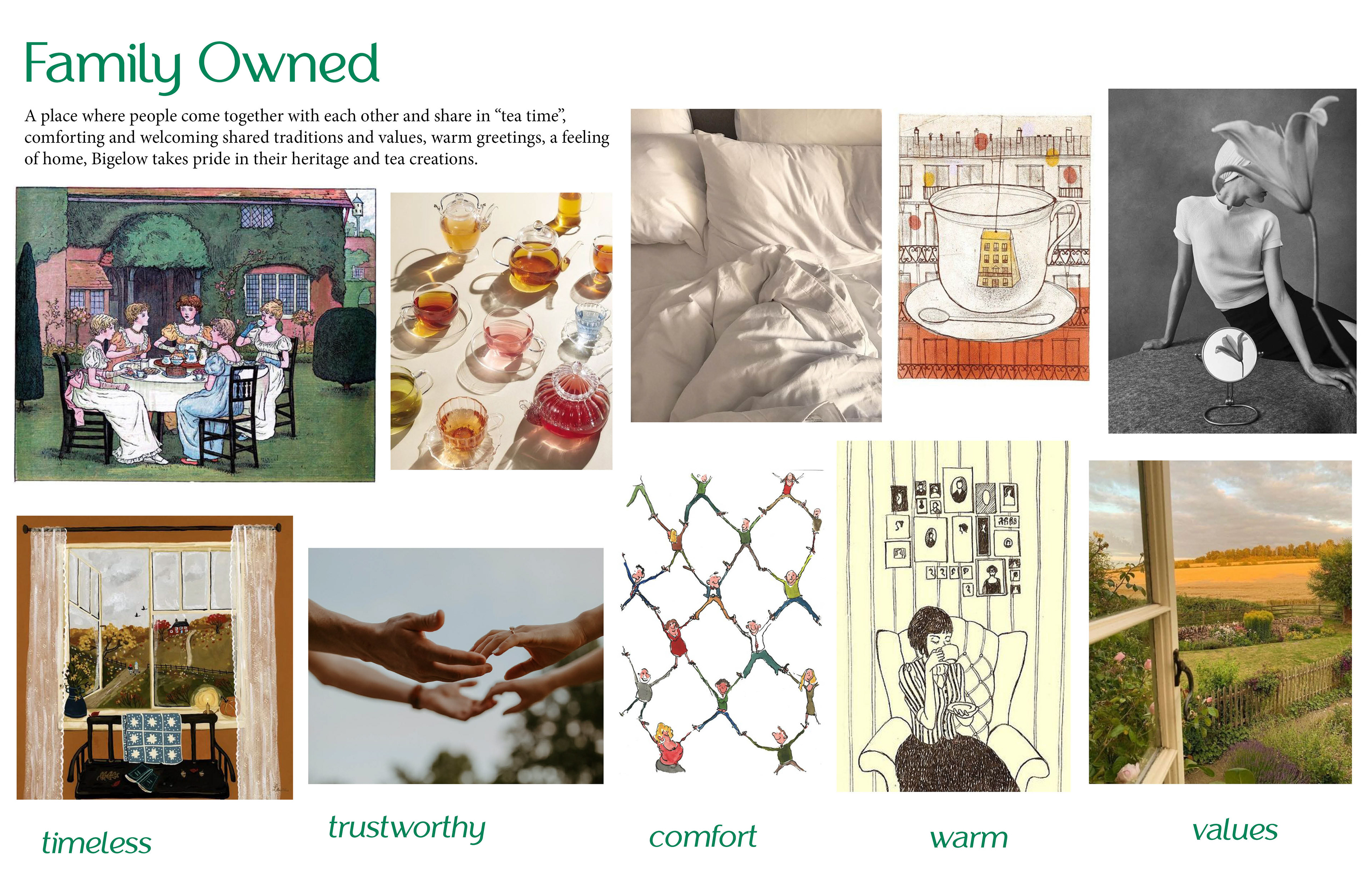
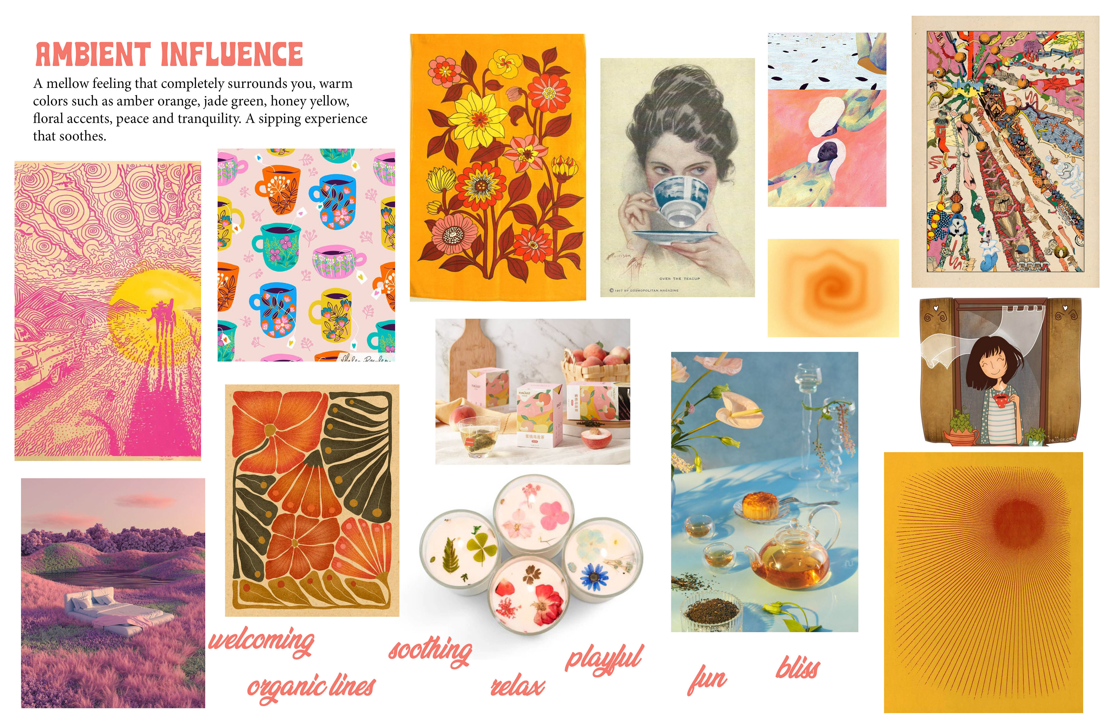
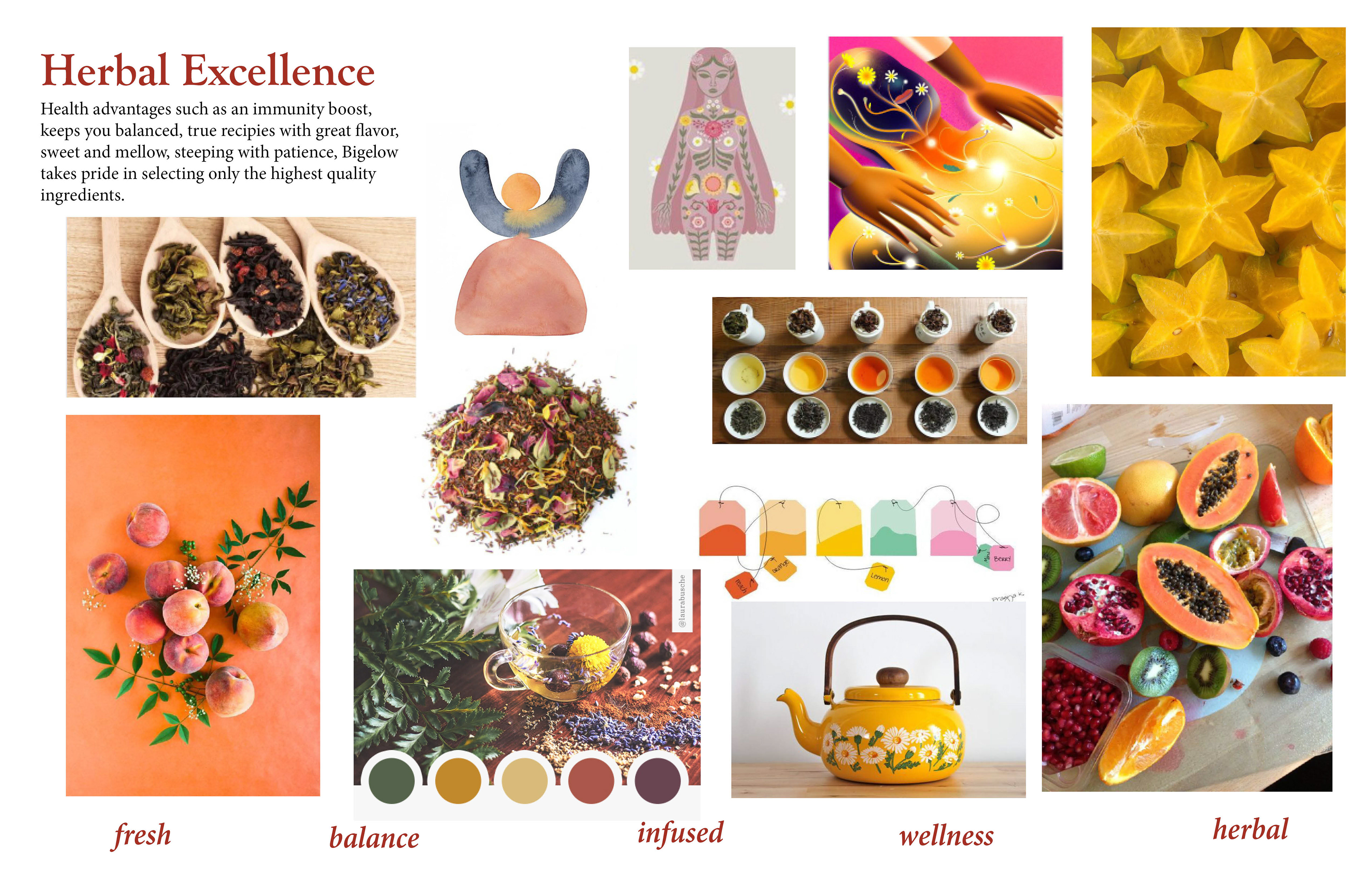
Mood boards: I began this project by creating 3 mood boards for inspiration to establish what direction I wanted my design to reflect. My vision was to create a fun, fresh, & balanced design.
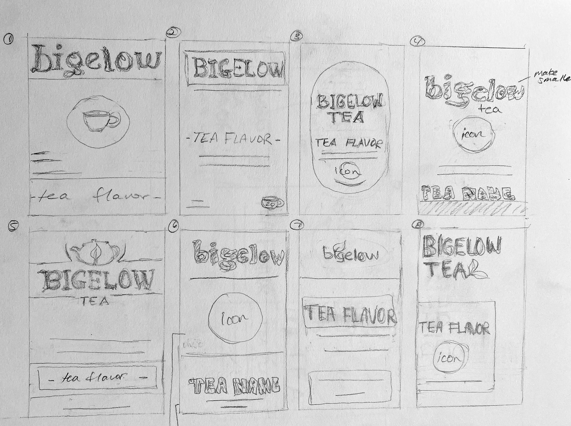
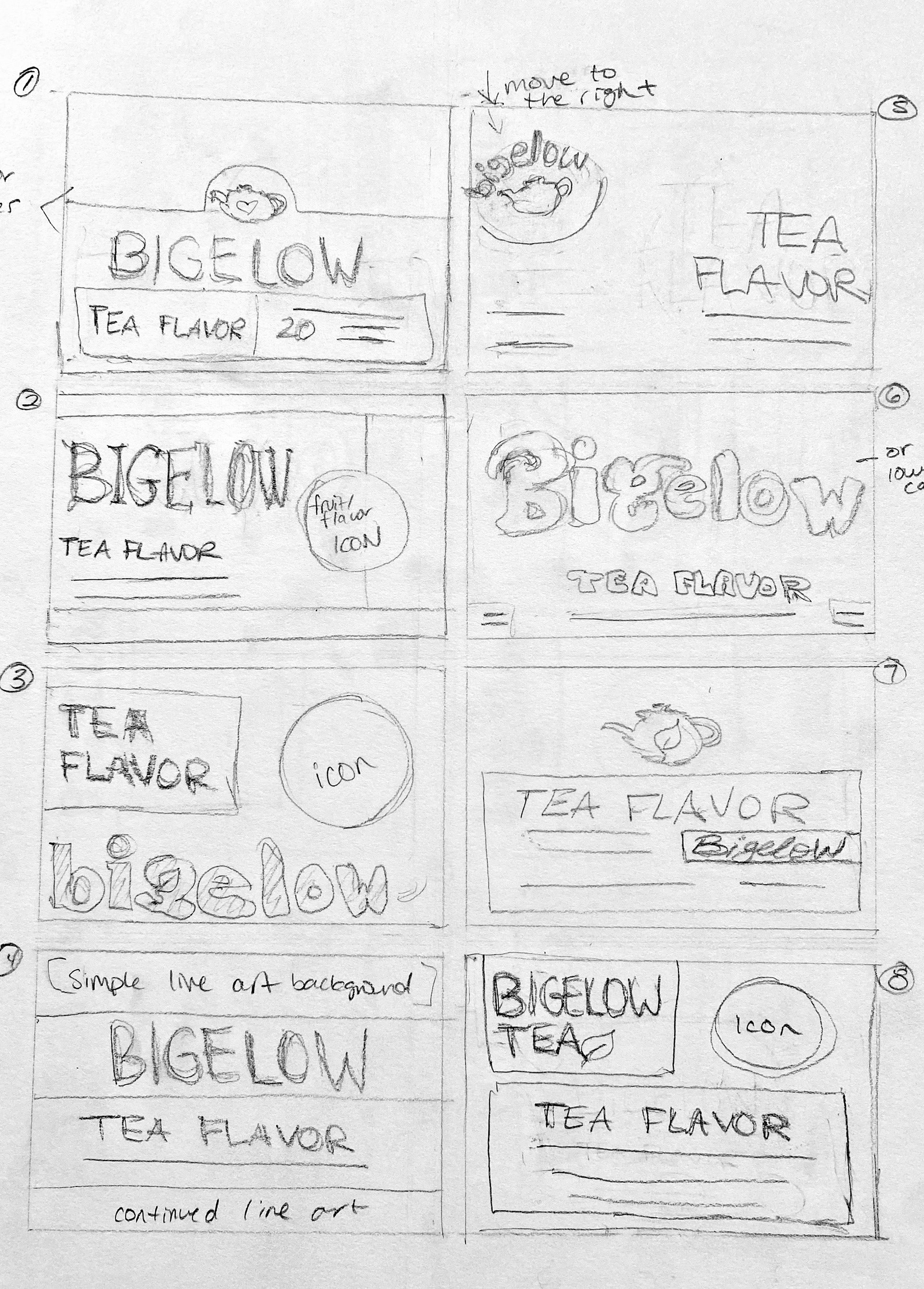
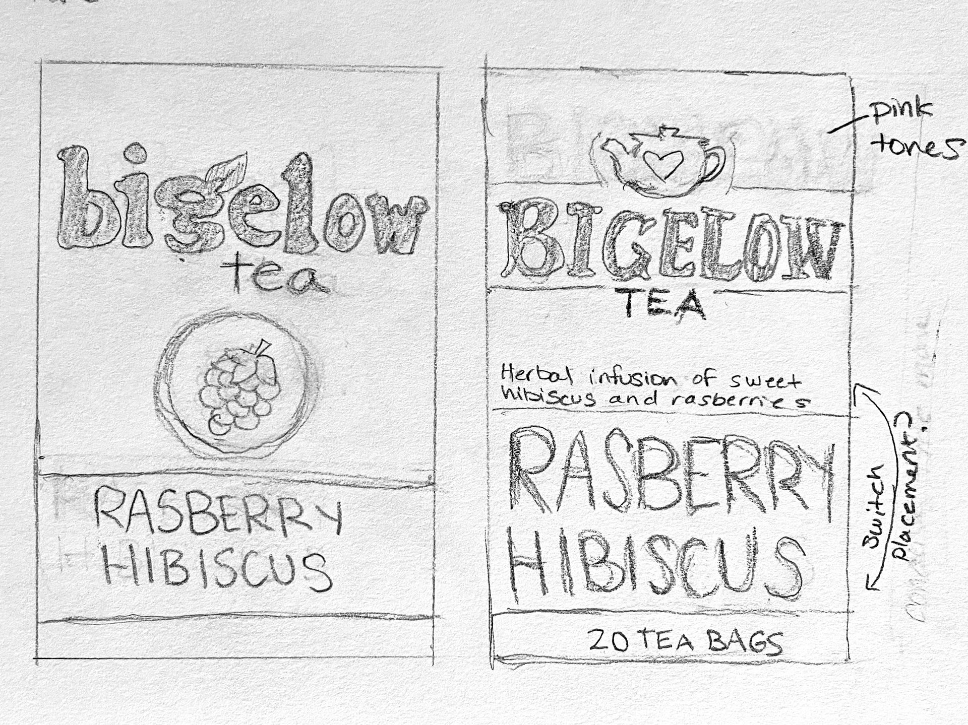
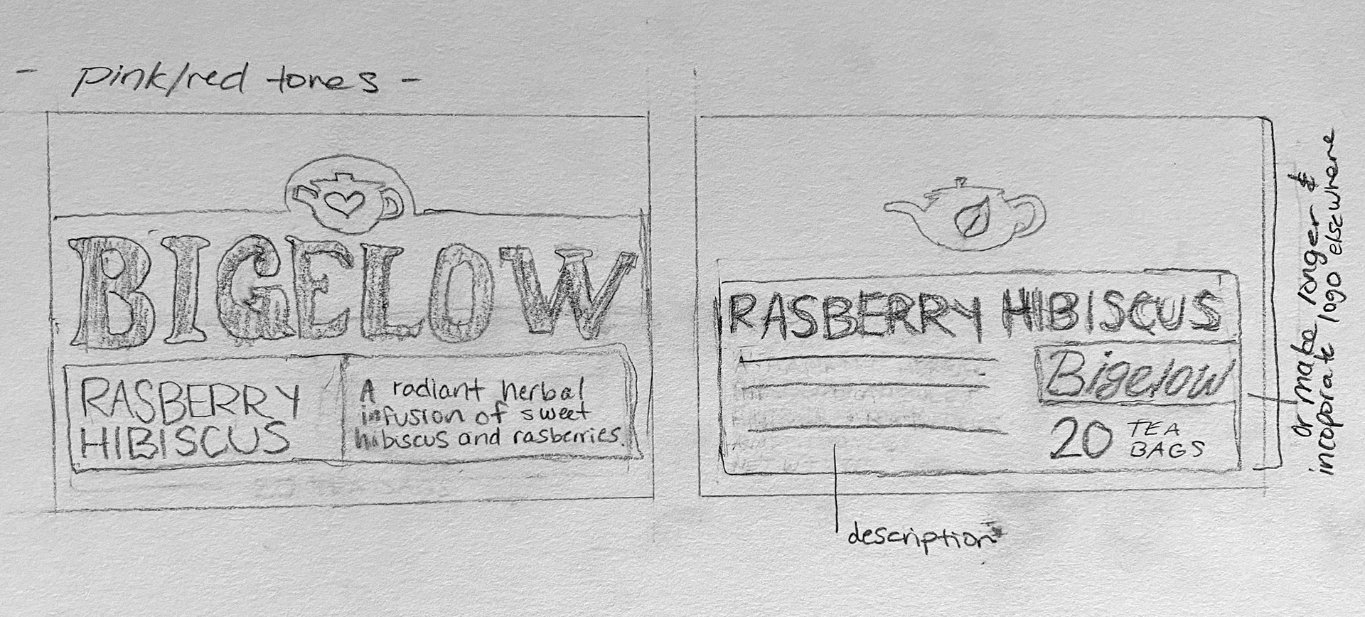
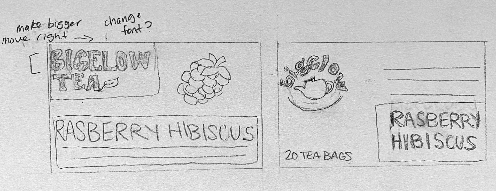
sketches
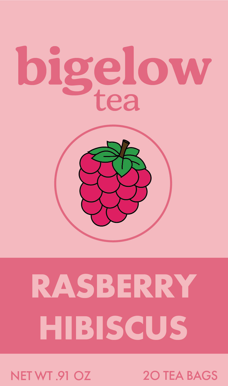
digital drafts: round 1


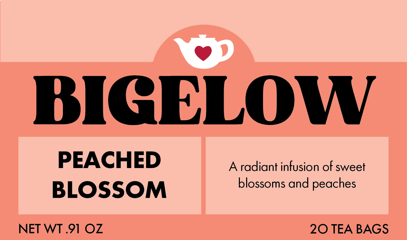
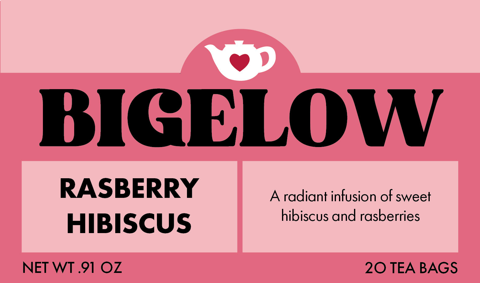
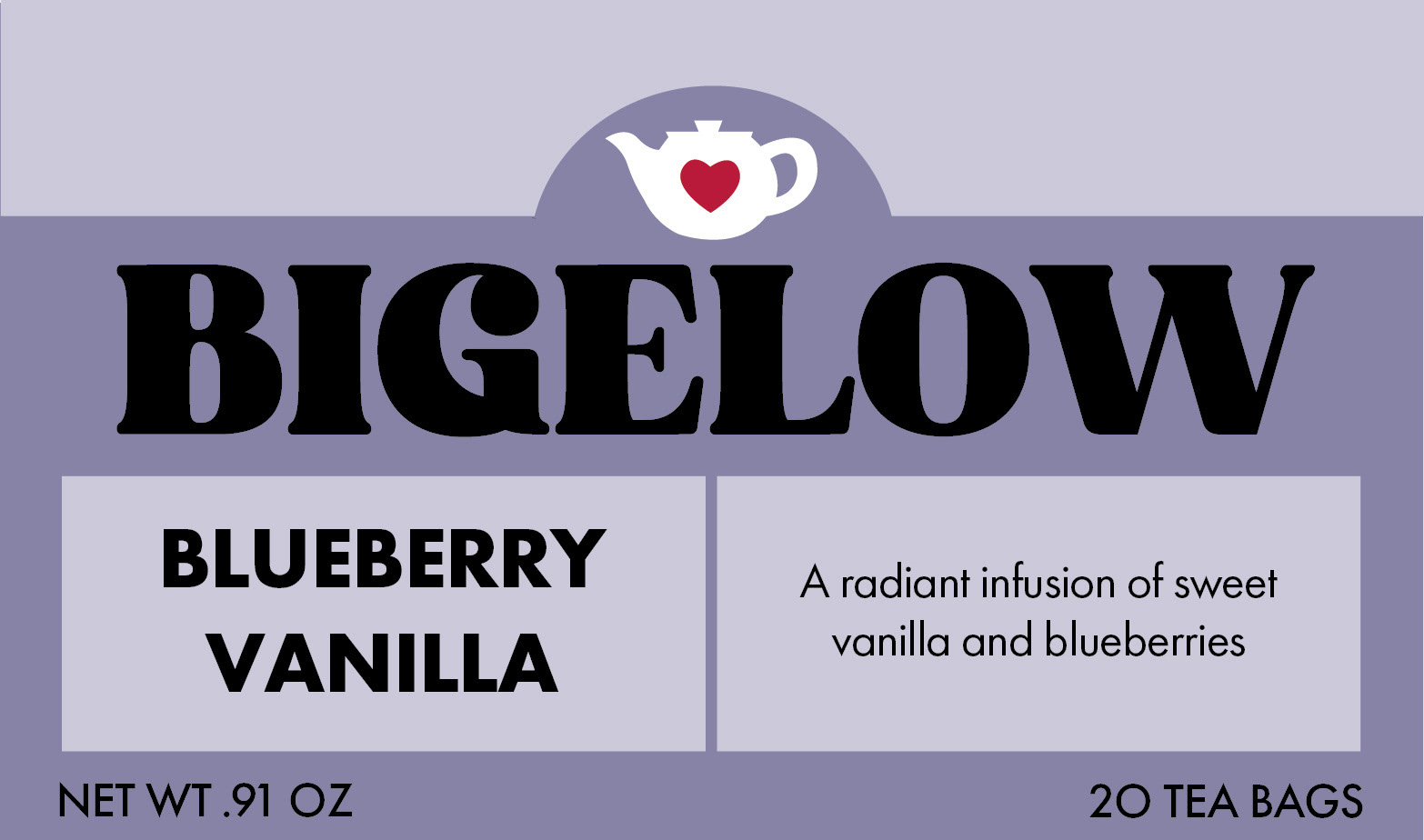
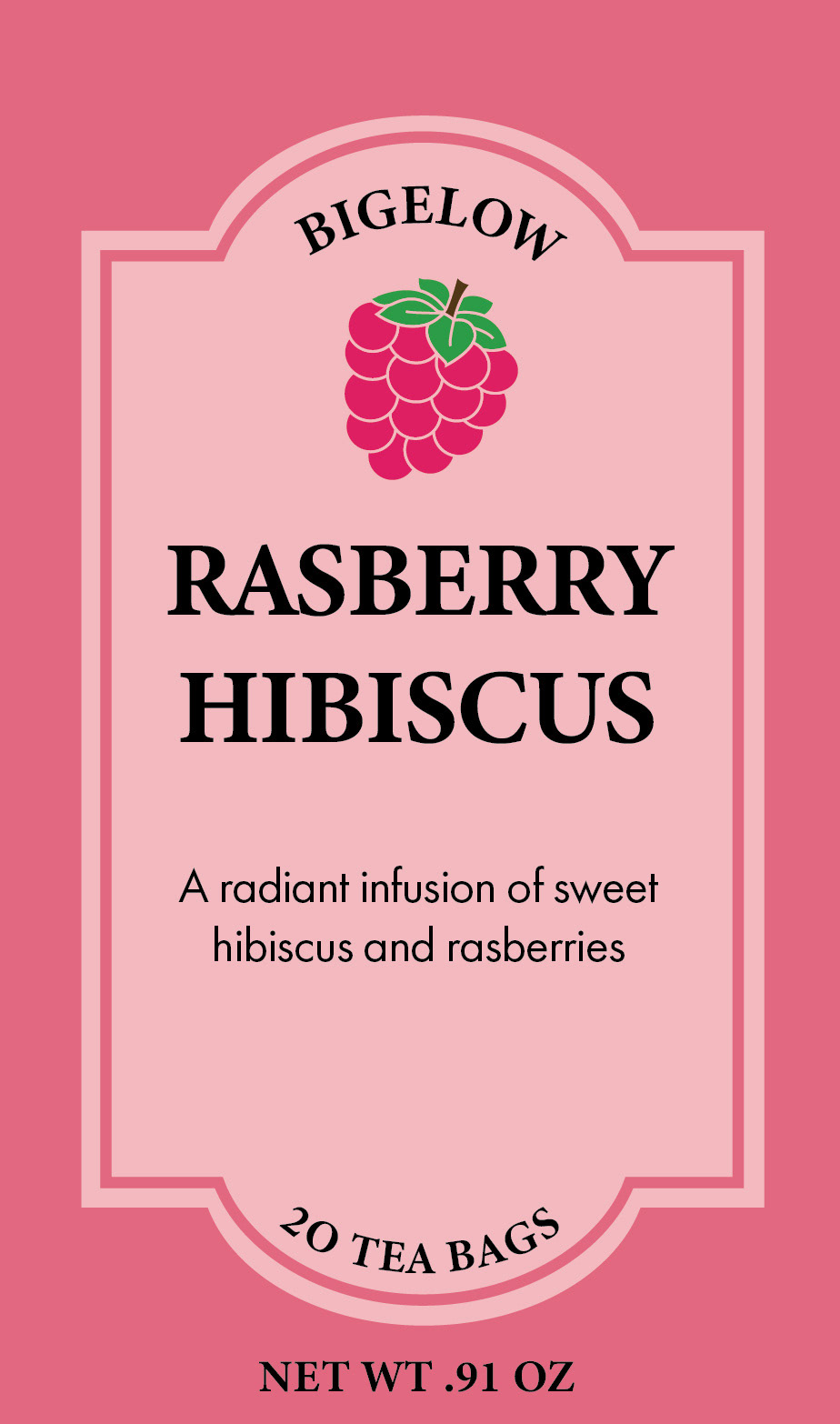
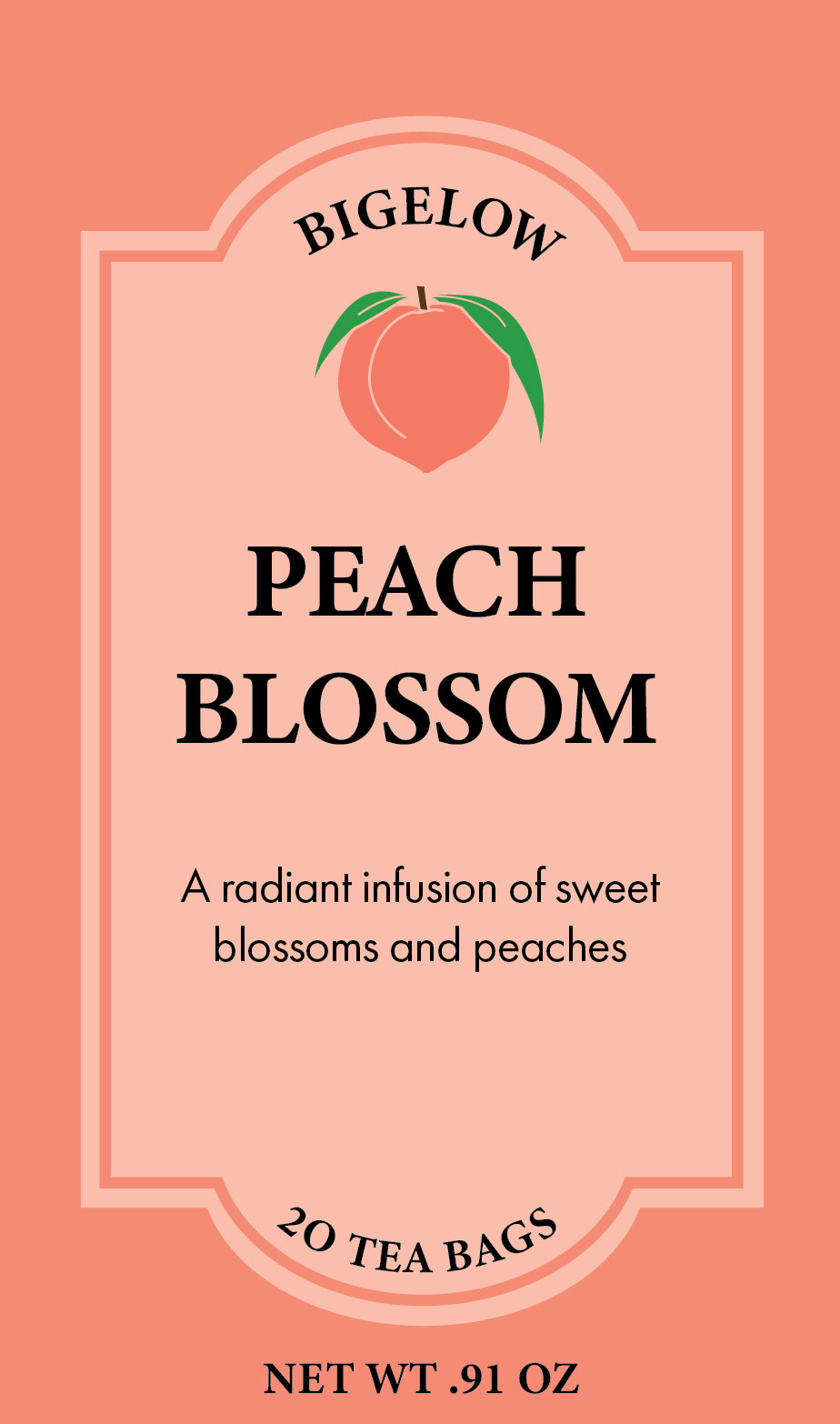
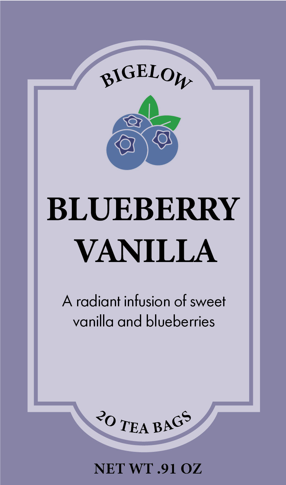
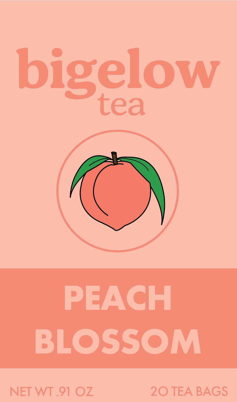
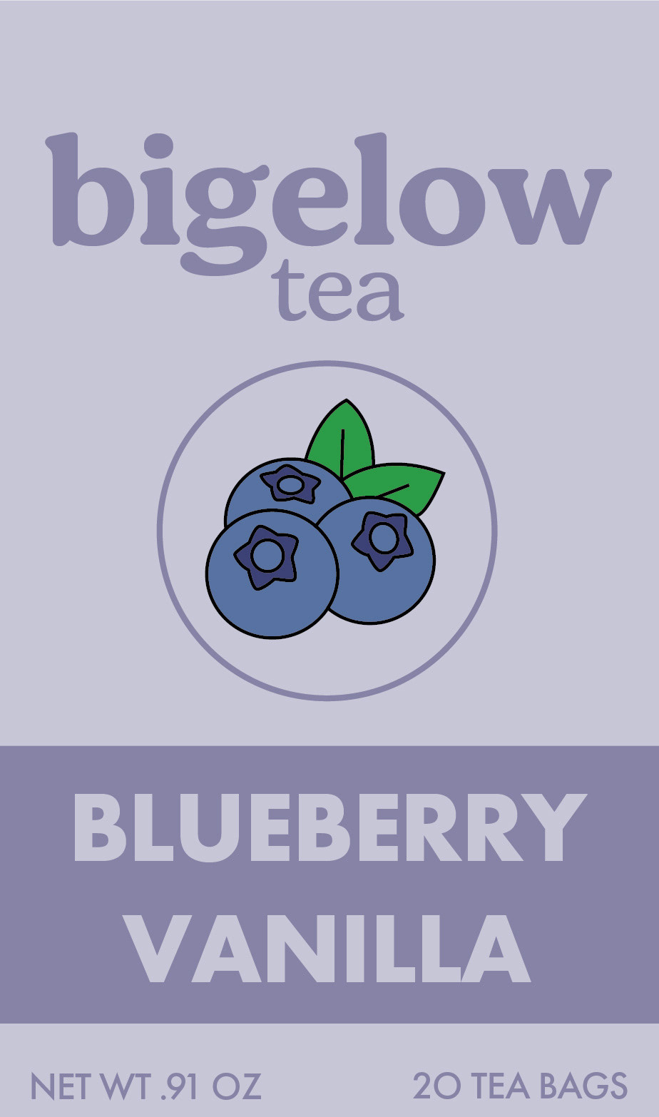
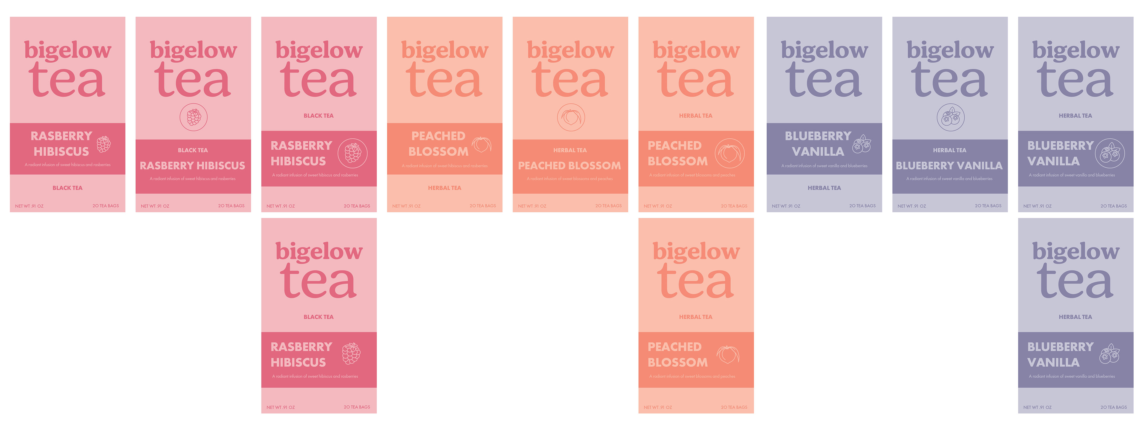
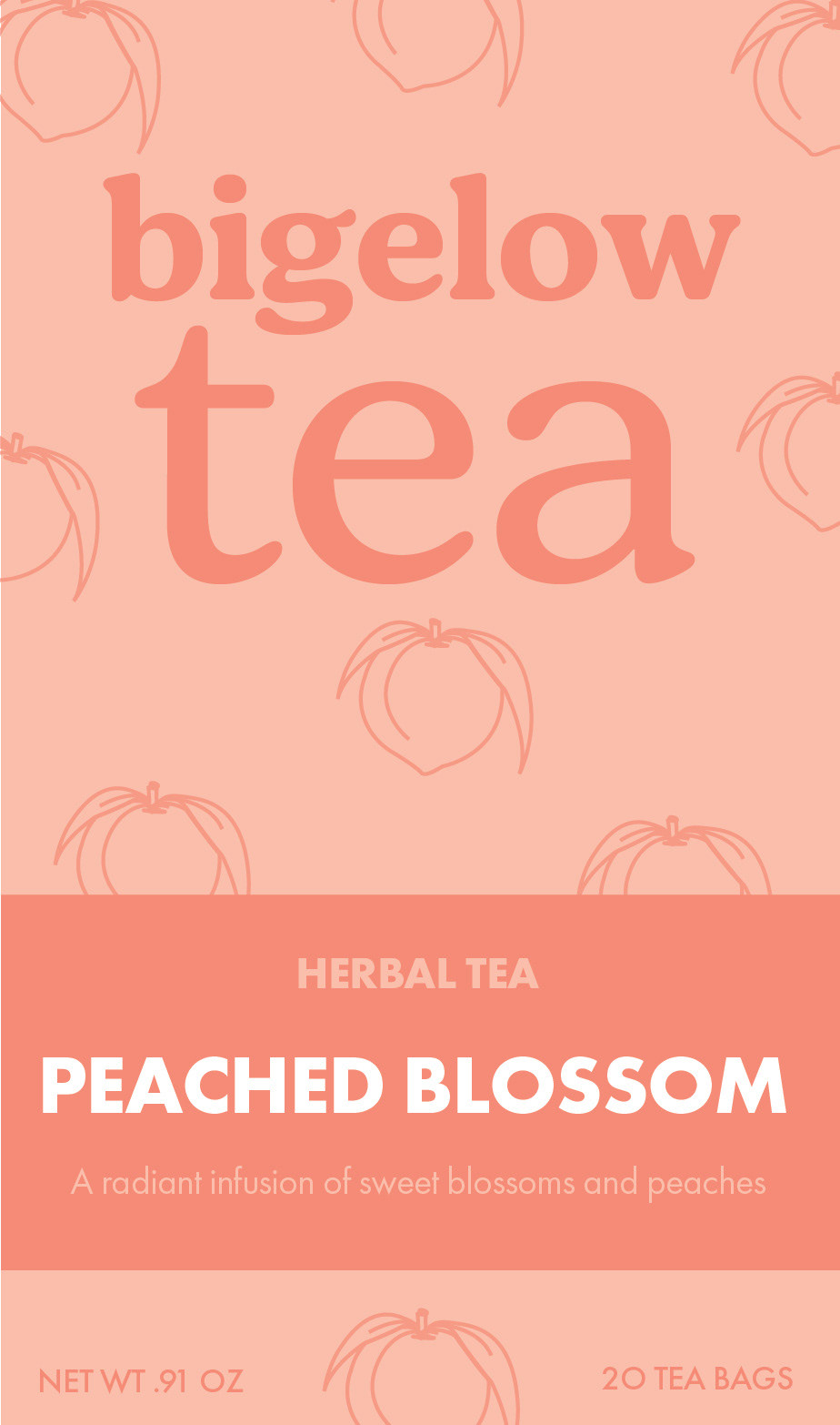
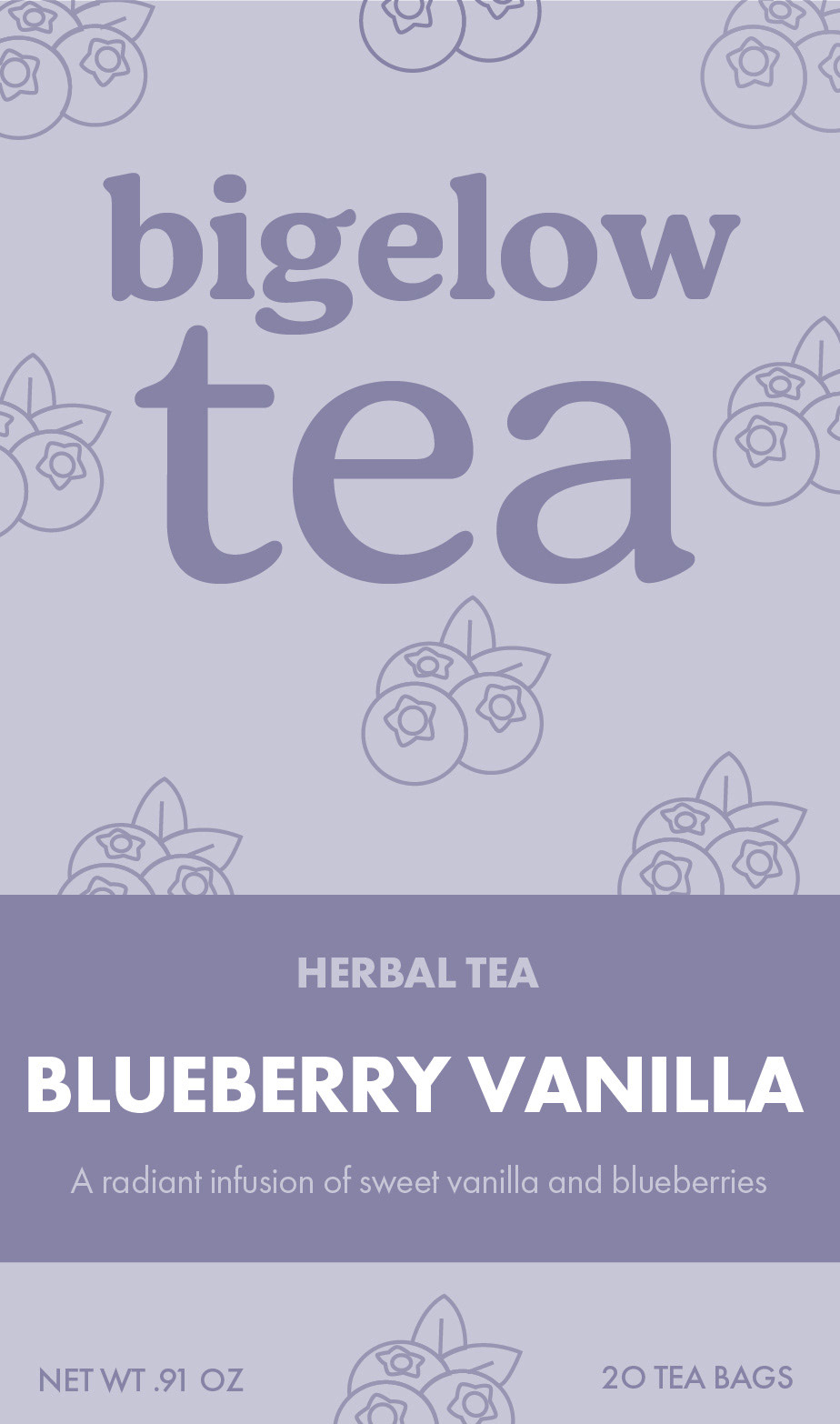
final flat front designs
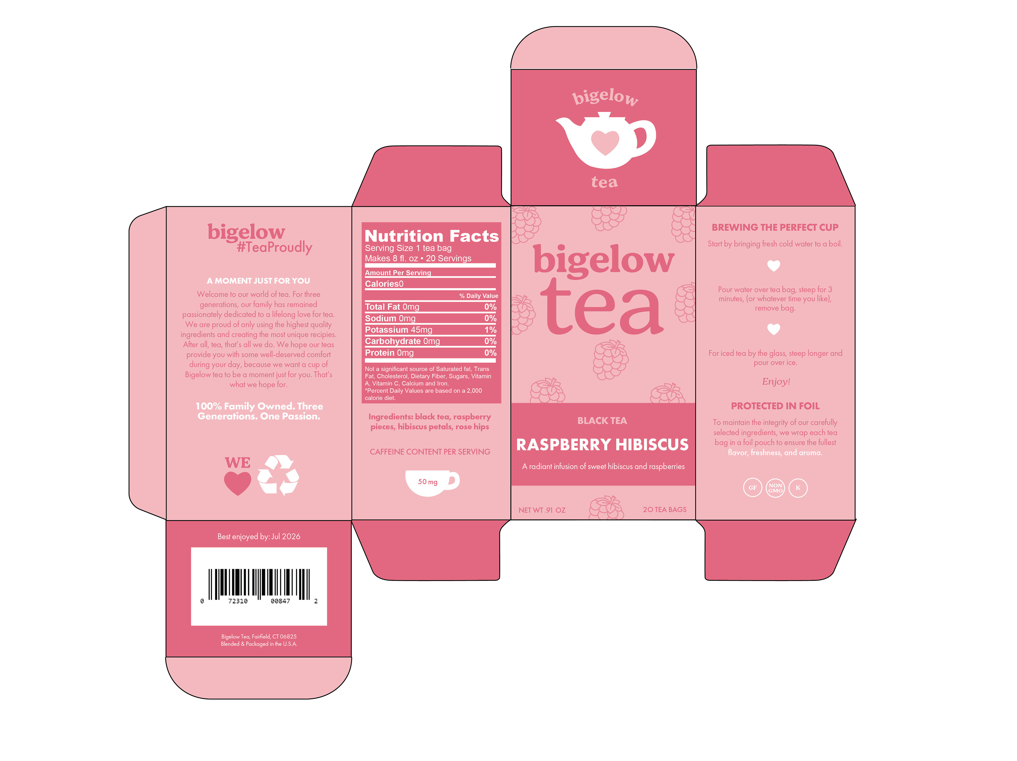
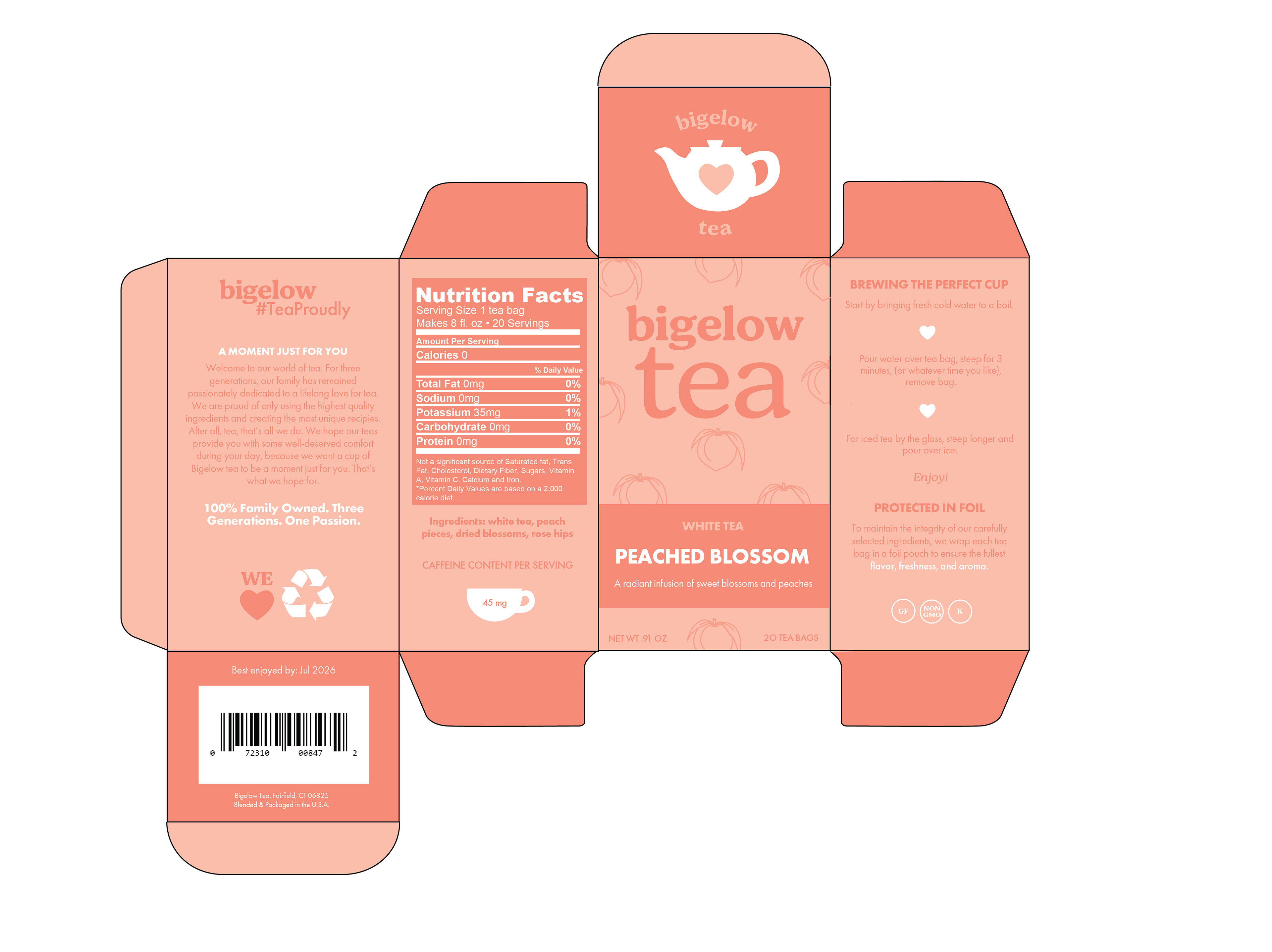
dielines
mockups